For a long time I couldn’t figure out what the problem was, but I’ve just sorted it out and am hurrying to report back to you. I noticed that when I read documentation in MSDN, my soul somehow feels good and calm, and when I read it in doxygen, I feel kind of nauseous.
No one will argue that documentation is very important, especially when you need to get to grips with a new large project. And the quality of the documentation matters a lot too: how it is put together and presented to the reader. It’s not a simple thing; it seems hard to measure. Although you could take a group of people, give them the task of finding a list of facts in documentation with different designs, and measure the time spent reading, searching for information.
So, if I’m interested in some class from the .NET library, then in MSDN the description looks like this:
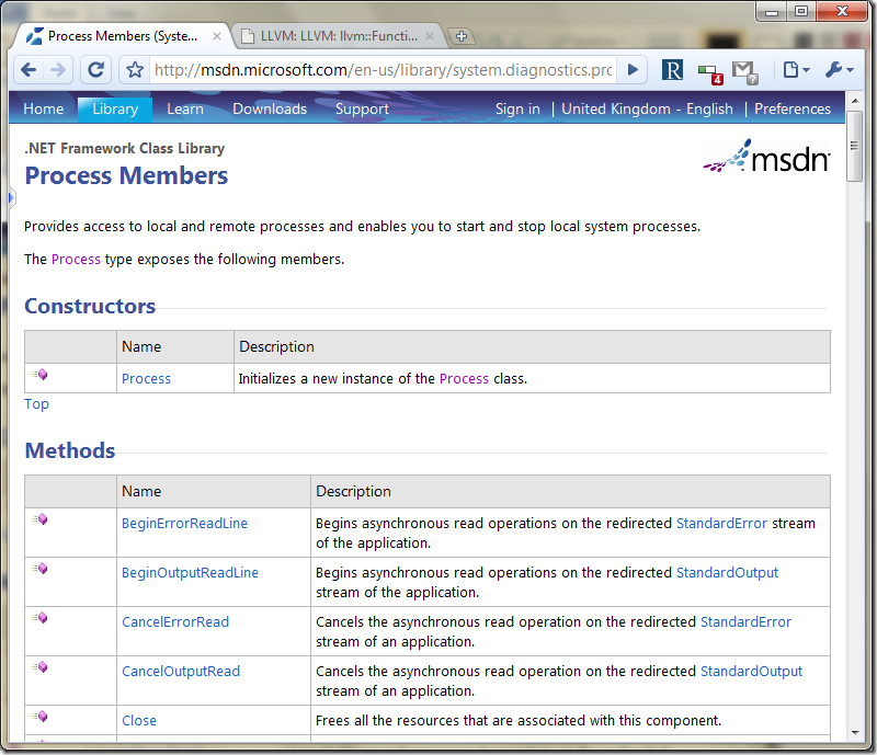
Here you can clearly see: the “constructors” section — one method, the “methods” section — five. The density of information presentation is equal to six units. Let’s look at the documentation in doxygen’s default style:
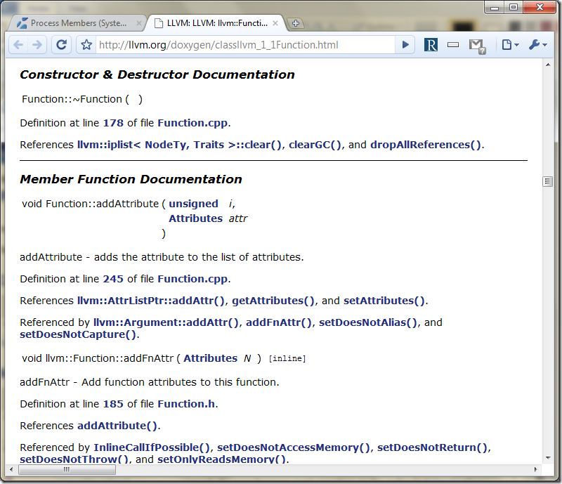
The sections are still visible, but it’s no longer as easy to count individual methods. Visually, the thick blue links dominate the method declarations and distract the eye. What’s more, on one screen we see the description of only three methods. So the notional density is three.
Notice how doxygen thoughtfully made the type “unsigned” into a link. If you forget what unsigned is, you can always follow the link and find out.
An important part of documentation is not only the description, but also source-code examples. In MSDN, we see source code formatted like this:
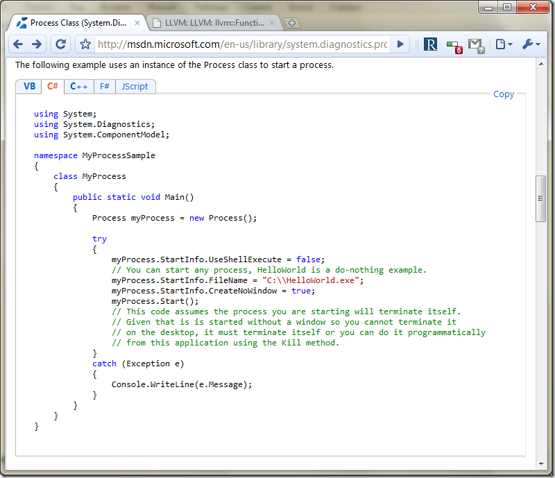
One, two, three, four — and that’s it. Four colors. Source code in doxygen looks like this:
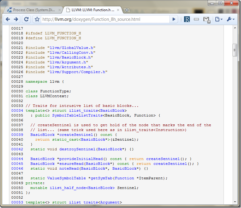
Here, though, we see these highlighting classes: 1) directives; 2) links; 3) keywords one; 4) keywords two; 5) comments; 6) built-in types; 7) identifiers, punctuation. Seven different colors in total. Of course, highlighting is a matter of taste, but if the user already knows that you can click any identifier and go to the place where it’s defined, then why highlight links in blue one more time?
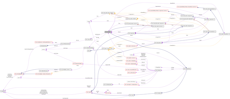
And finally, a collaboration diagram from doxygen, reduced by a factor of five. Is anyone really going to use it at its real size (3600 by 1500 pixels, view original)?

Links to manuals and personal experience with maintaining documentation, configuring doxygen, and so on are welcome in the comments.